McAfee Safe Family: Branding & Visual Design Updates
About Safe Family
Safe Family is McAfee’s parental controls app, available on Windows, Android phones, and iPhones. It allows parents to monitor what their kids do on their devices, set screen time limits, block inappropriate apps and websites, and track their kids’ location.
Timeline
2018-2019
The Problem
• Safe Family’s branding still matched Intel Security guidelines and needed to be updated to align with McAfee’s new brand
• Outdated visuals needed redesigning
• Outdated UX/UI and information architecture needed improvements
The Solution
• Complete branding overhaul and visual refresh, including an updated logo and style guide, and brand new illustrations to better align with McAfee’s new brand
• Improved UX/UI and information architecture
• Accessibility improvements to widen the user base
Main Goals
Update the visuals and illustrations in Safe Family to better align with McAfee’s new branding
Create a customizable parental control experience that facilitates trust and communication between parents and kids
Process
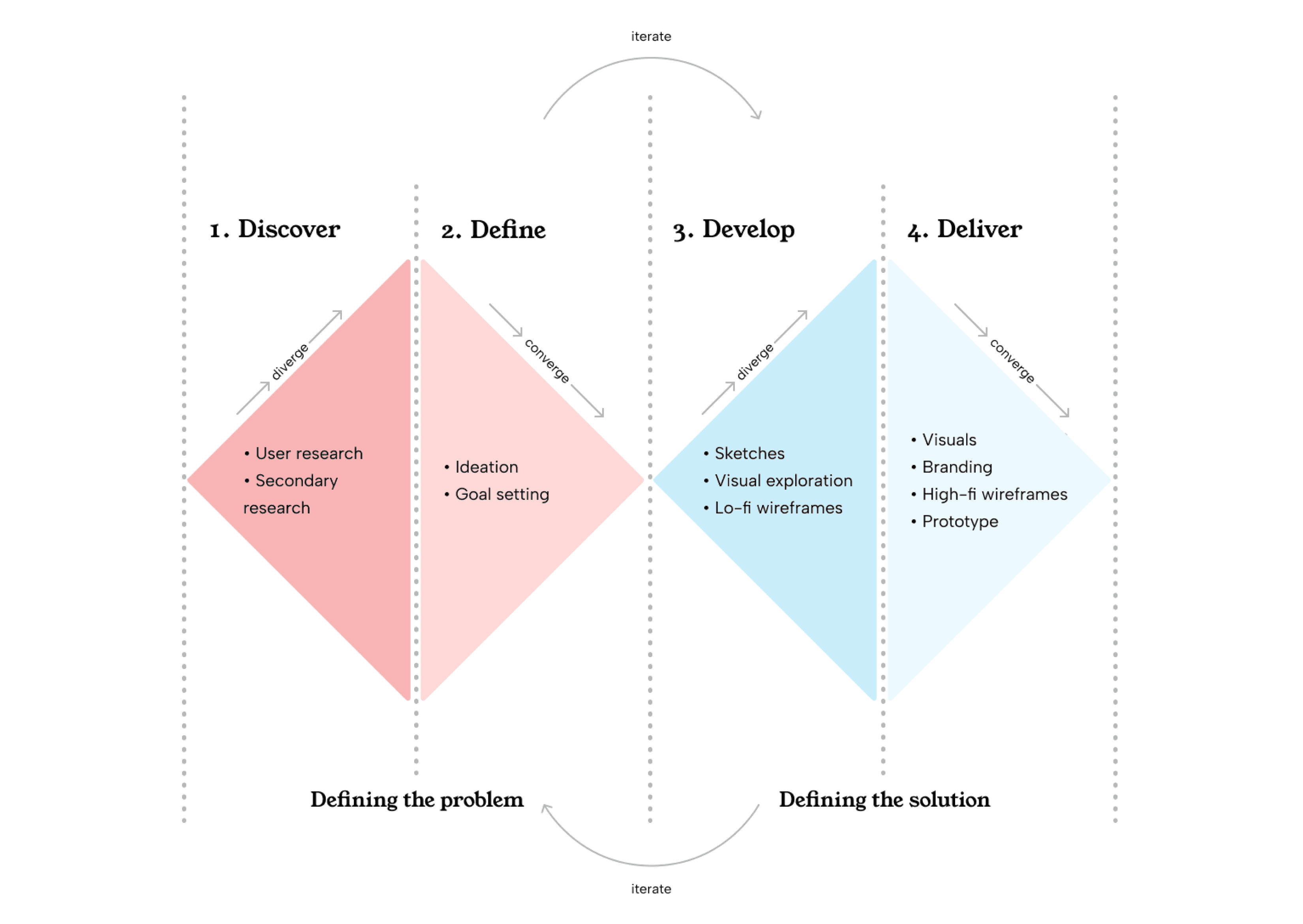
The general gist of the process during each sprint that I worked on Safe Family involved figuring out what user needs were via research of some kind; planning out what we would design; creating wireframes, flows, and visuals; reviewing the design with stakeholders; then validating the design.
Sometimes the validation involved analyzing qualitative and quantitative metrics after shipping the changes; sometimes we had time to iterate on a design multiple times; sometimes we were able to do more in-depth research than usual - this all depended on many factors, but regardless, the main process of research, plan, design, review, and validate always prevailed.
Research
To inform our designs over the course of our work on Safe Family, the UX team conducted research at every step of the way. Even when we didn’t have the resources to conduct primary research, we sought to inform our designs by conducting secondary research, heuristic evaluations, competitive analyses, and guerrilla usability testing.
According to Pew Research Center,
• The majority of parents monitor their child’s online behaviors by checking browsing history
• Nearly all parents discuss appropriate online behavior with their kids
• 65% of parents have taken away their child’s cell phone privileges as punishment
• 55% have limited the amount of time their kid can spend online per day.
• Most parents also report that they typically get in touch with their child via phone
• Almost half prefer to contact their kid via text message
Based on the research conducted by the UX Researcher, including in-home visits, a usability study of the onboarding process, and a large-scale demographic survey, we uncovered that the needs and practices of Safe Family users do indeed line up with the Pew Research Center survey results.

Parents
• Think of the parental control app as the expert and expect rules to be set up for them
• Want to have the flexibility to override certain rules and make exceptions
• Main priority: restricting inappropriate content and only allowing use of apps or websites that they approve of in advance
• Often use information about what their child does online to start conversations with them.

Kids
• Kids ages 2-19 have Safe Family on their phones
• Most kids using Safe Family are 10-15
• Tend to have multiple devices, usually a smartphone and a desktop or laptop device.
• Parents tend to report that their kids are either just as comfortable or more comfortable using technology than they are
While many parents already have their own ways of supervising their children’s online behavior, one of the main goals of establishing the Safe Family app was to make that process even simpler by facilitating open communication between parents and children.
User Flow
We created a streamlined user flow to lay out the information architecture.
Sketches & Visual Exploration
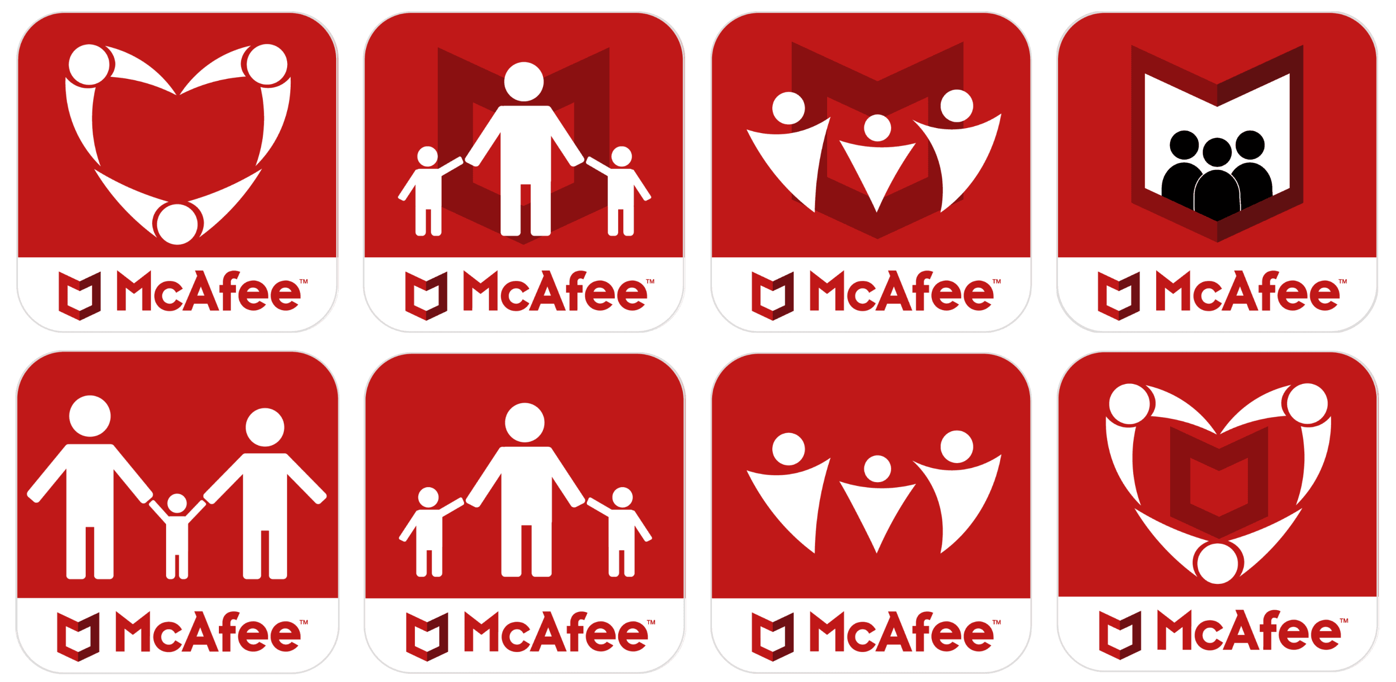
These are some sketches and visual explorations of ideas for visuals, branding, and logos.
When redesigning the Safe Family logo, I wanted it to have a similar vibe to the old one, indicating family and security, but a more modern feel that was more aligned with McAfee’s new branding.

Old McAfee Safe Family logo
I also wanted the updated family icons and other illustrations to look friendly, warm, and inviting.
Some of my sketches:
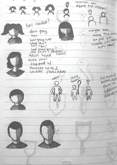
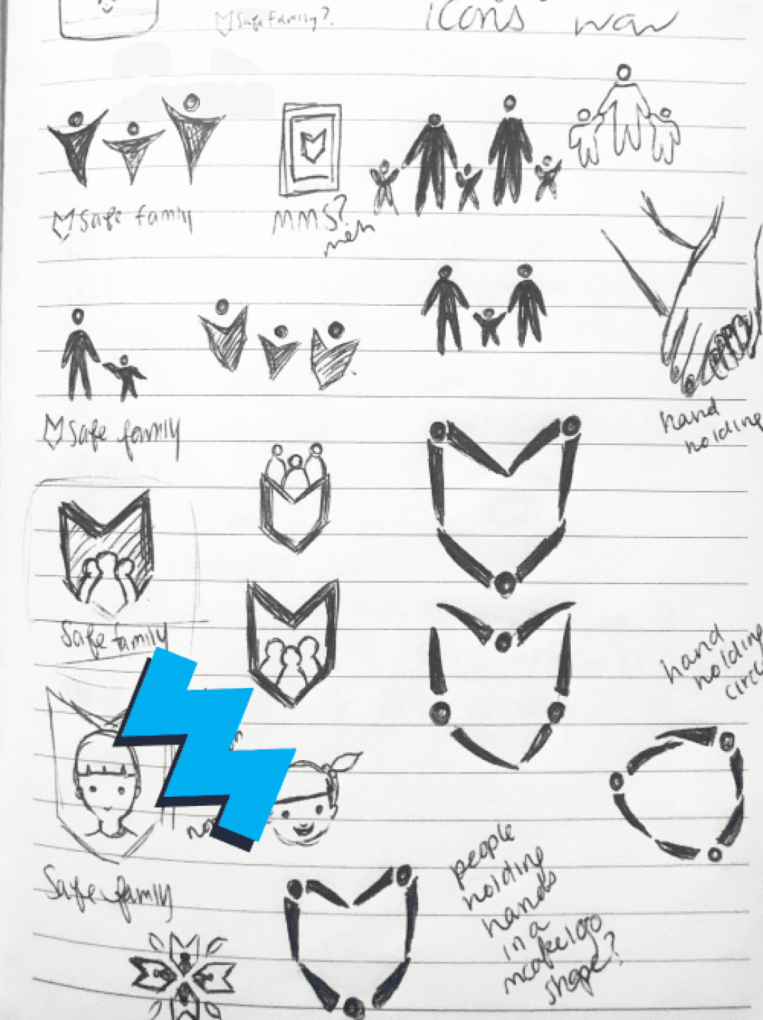
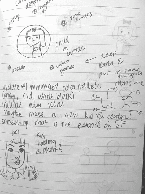
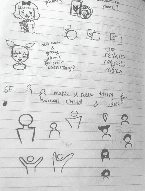
After sketching out my ideas for the logo, I created some of them in Adobe Illustrator to see which options were worth exploring further.
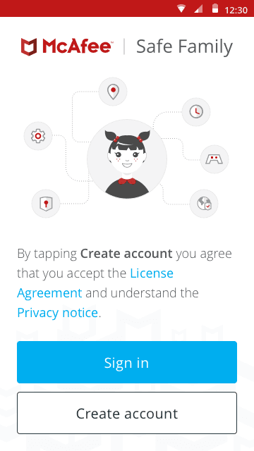
I also did a visual exploration of potential visual styles for the illustrations for the sign in page. This illustration would form the stylistic basis for the other illustrations within the Safe Family app.
Style Guide & Branding
Once we finished with creating flows and ideating, we put together a style guide.
Colors
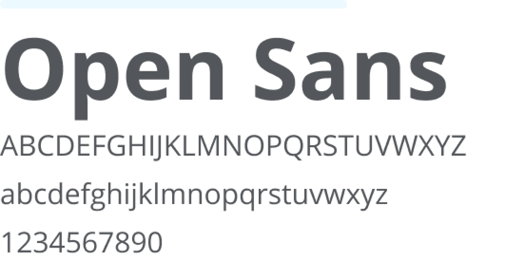
Typography
Branding
I ultimately created a logo that included 3 family members side-by-side as in the old Safe Family logo, but more streamlined, modern, and in line with McAfee’s updated post-Intel branding.

Updated McAfee Safe Family logo, designed by me
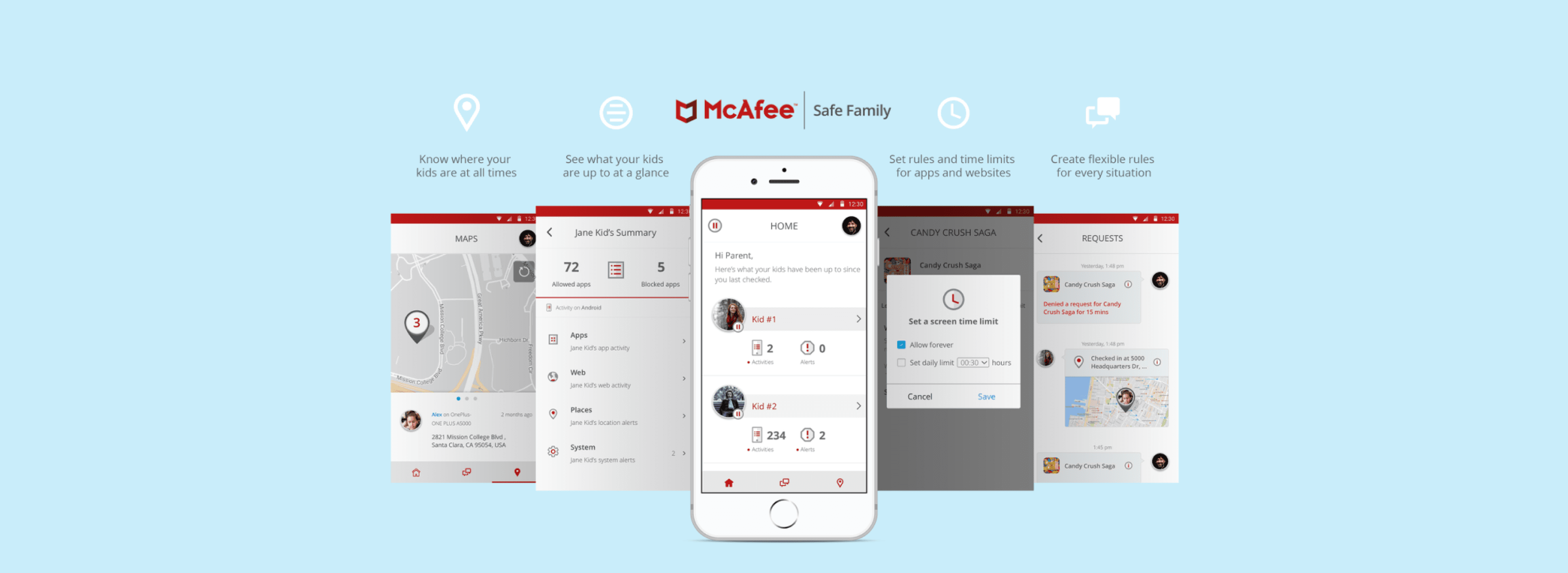
Final Visual Design
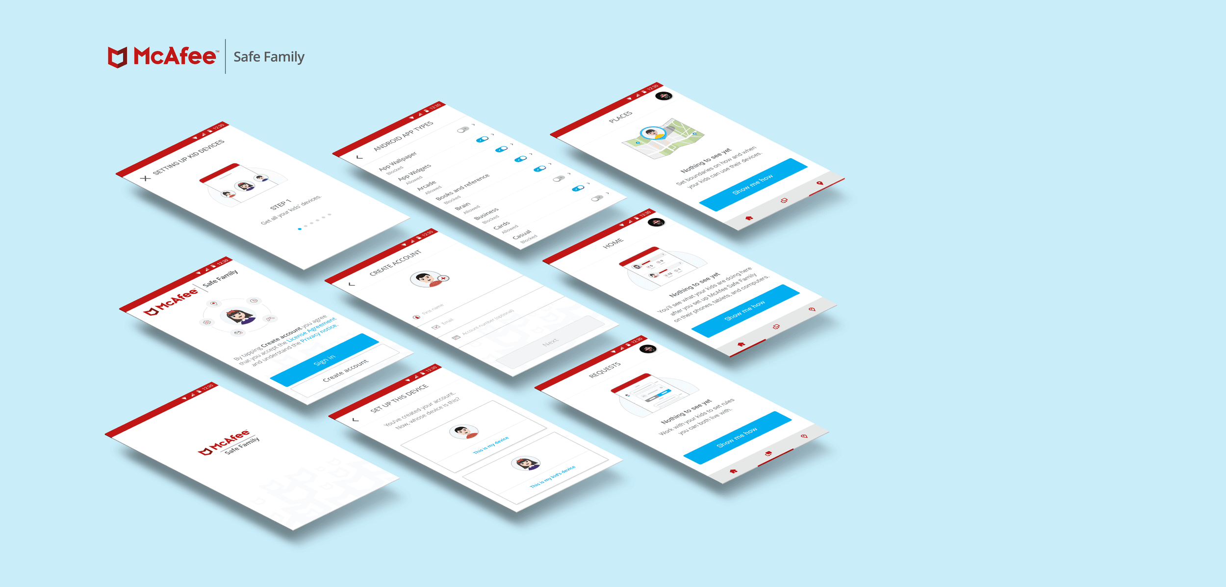
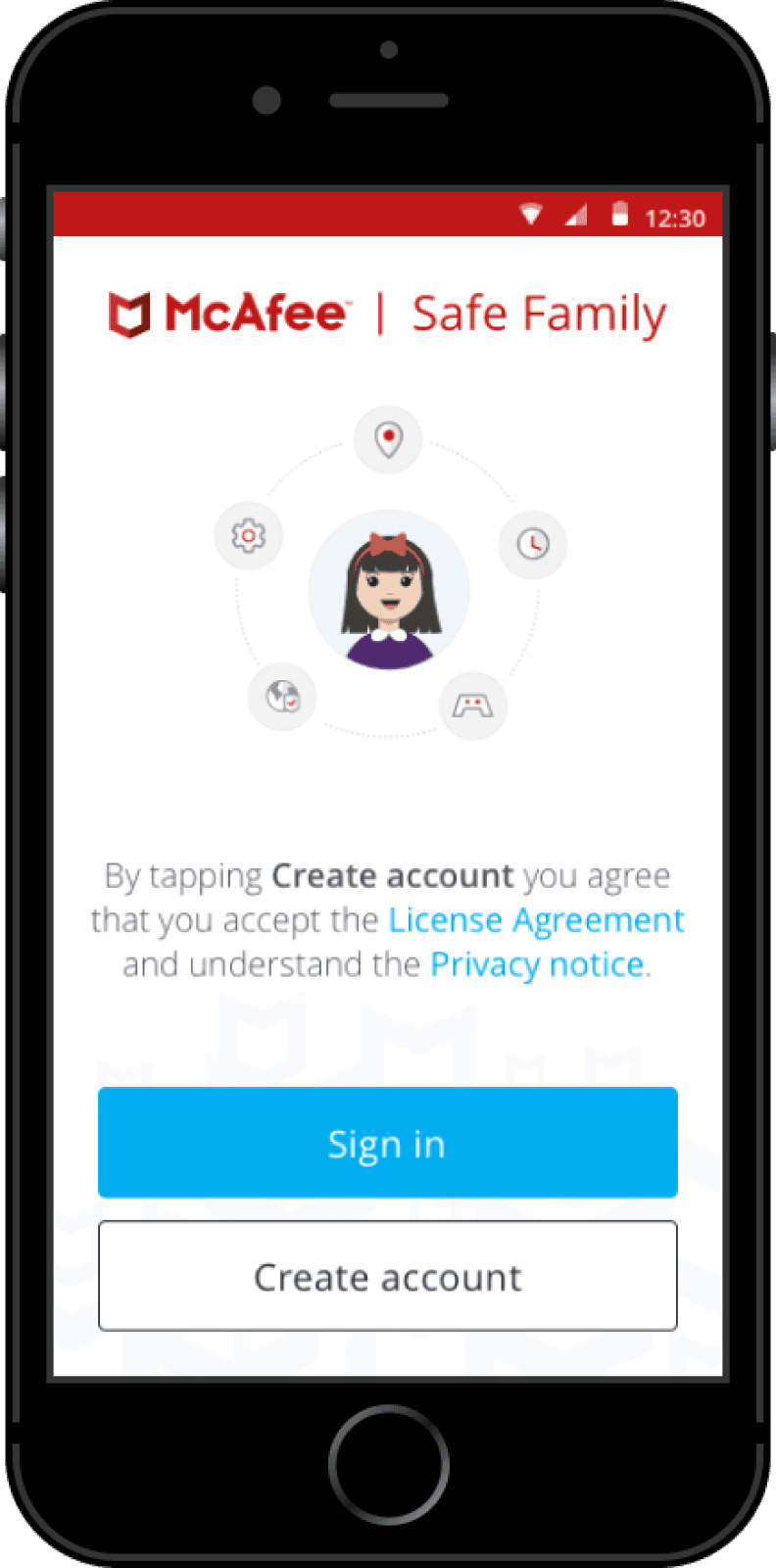
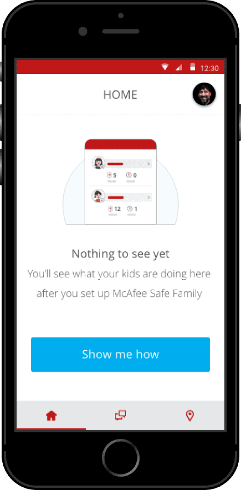
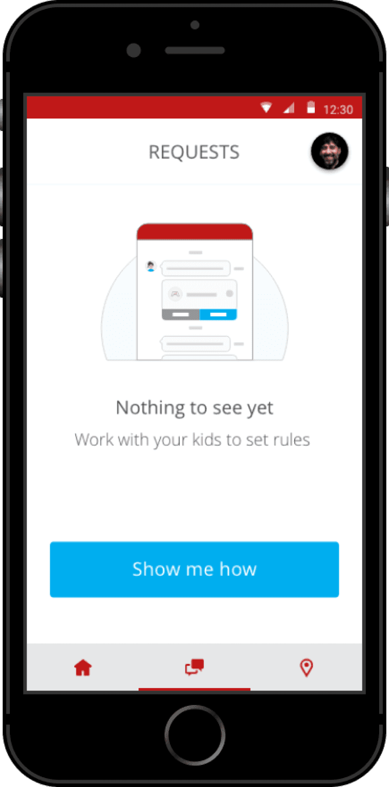
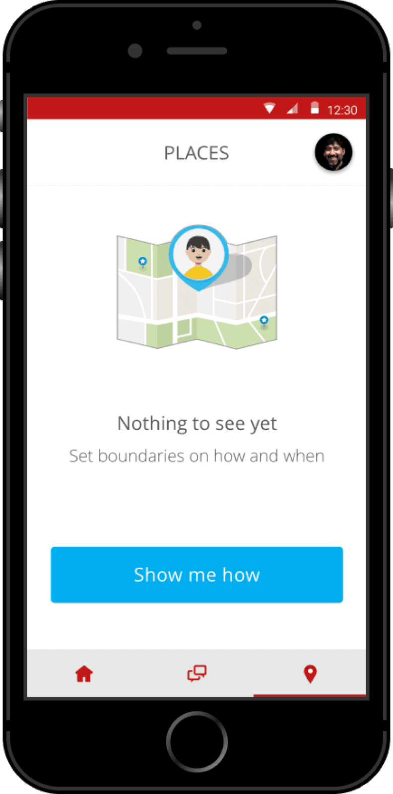
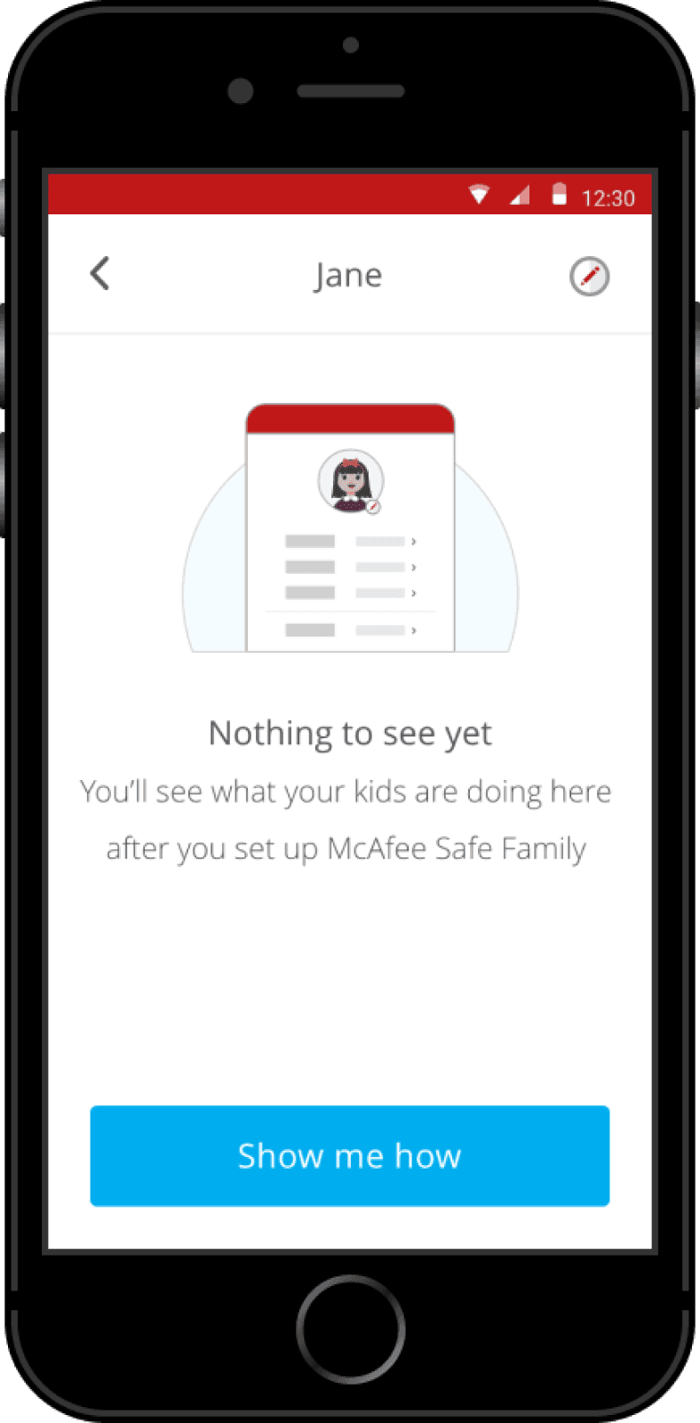
After getting the information architecture, flows, and branding down, we put together the final visual designs. I was responsible for creating all the illustrations and also supported the UX/UI during the entire process.
Impact
• Increased rating in the App Store (3 → 4.3 ⭐)
• Improved branding and visuals that better align with McAfee’s new brand post-Intel spinout
• Improved documentation and troubleshooting processes
Reflections
Always push for improvements to the design
An app is never fully complete, and there is always room for improvement. This may be because of anything, from changing design trends, to new insights into user needs, to updated business goals. Either way, designers should always be learning, growing, and developing new skills so that the products they’re working on can also progress in a positive direction that delights the product’s users.
Maintain solid documentation of any issues you encounter
During my time working on Safe Family, we worked on compiling a list of design bugs within the app. Although this QA work was not the most exciting, having documentation of all the design bugs within a Confluence space that was easily accessible to all stakeholders allowed us to compare how certain screens were implemented vs. how the mockups were designed. This allowed for us to push for more design updates that otherwise may have been out of scope for certain releases.
Constantly be aware of marketplace trends in your domain
As designers, it’s our job to maintain an understanding design patterns and trends, but even the most aesthetically pleasing and easy-to-use apps can’t succeed if the features aren’t something that users want.
Other Projects
Back to home
