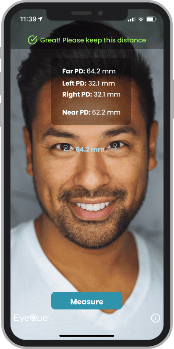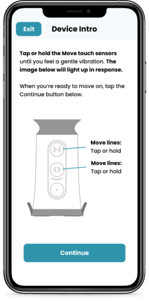
About EyeQue
EyeQue is the leader in at-home vision testing that aims to demystify vision by offering solutions that allow users to test their vision in the convenience of their home.
About VisionCheck
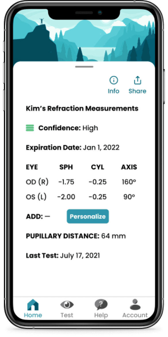
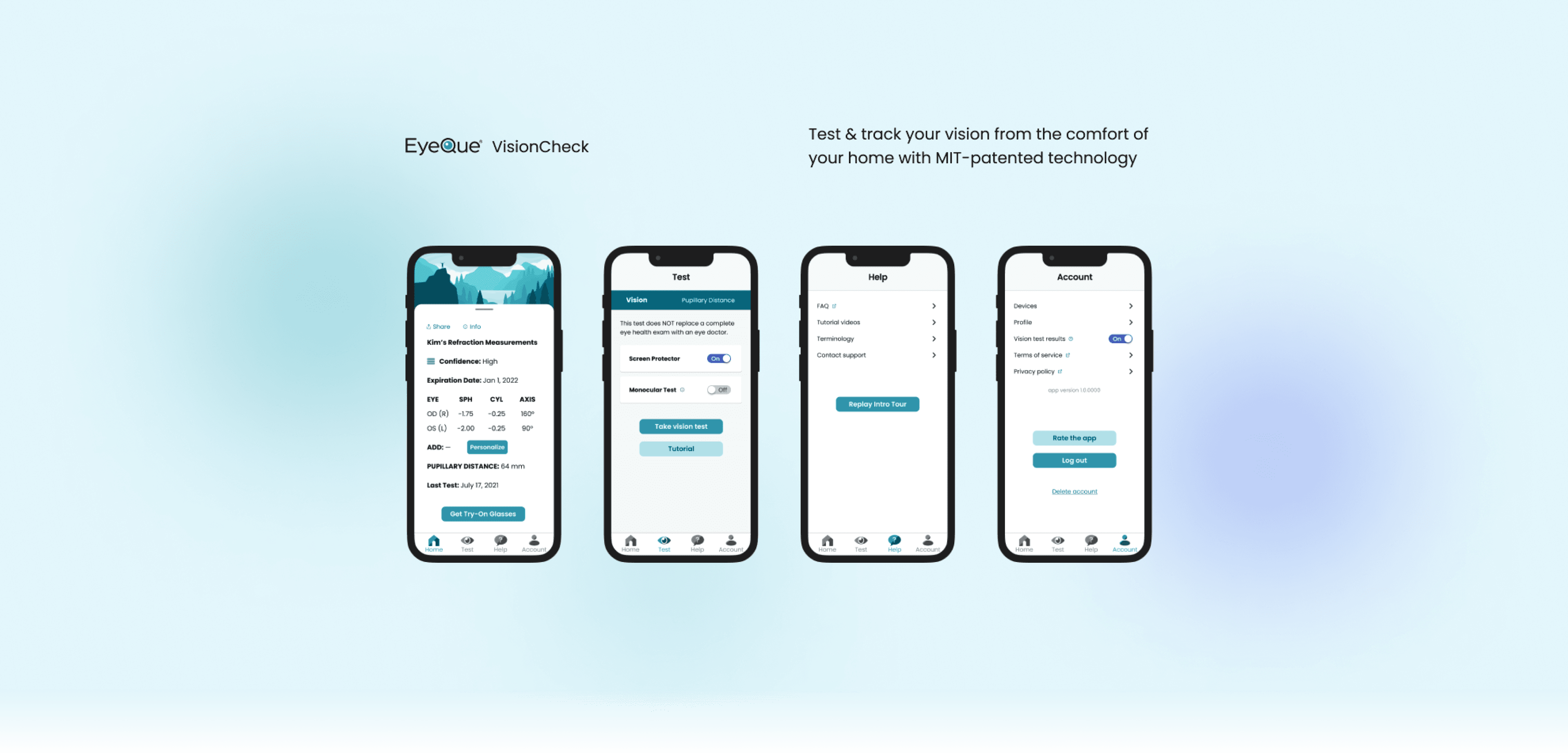
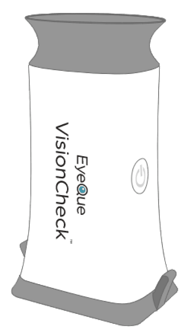
VisionCheck is EyeQue’s most popular solution for testing your vision in the comfort of your home to get the numbers required to order glasses online. The VisionCheck is a hardware device that uses inverse Schack-Hartmann technology to manually measure refractive error when attached to your phone, using the phone screen as a light source.
Product Team
Myself, one UX/UI Designer, two developers (iOS and Android), two QA engineers, one product manager
My Contributions
UX/UI design
Visual design
UX research
Information architecture
Illutrations
Tools
Figma
Adobe XD
Adobe Illustrator
Confluence & JIRA
Userlytics
My Role
UX/UI Designer
Timeline
March 2022 - February 2023
The Problem
The Solution
Process
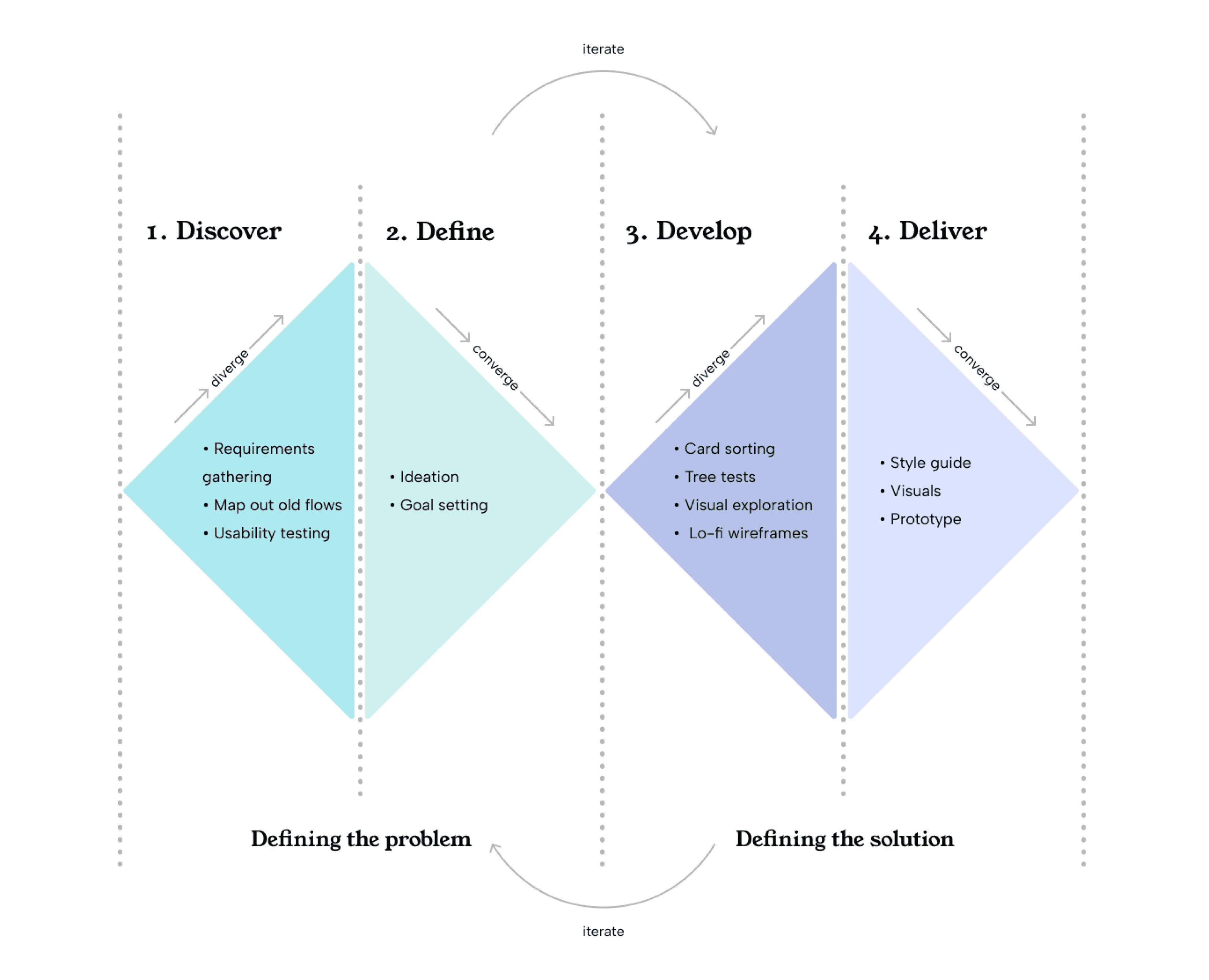
We used an iterative double diamond process. In the discovery phase, we focused on gathering requirements, determining the pages that were required, and conducting internal card sorts, external tree tests, and usability testing at different stages of the project.
In the define phase, we analyzed the data produced in the discover phase, set goals, and ideated.
In the develop phase, we sketched, did visual explorations, and created lo-fi wireframes. In the final deliver phase, we created a style guide based on the visuals created after finalizing the navigation, as well as prototypes.
Discover
Old User Flow & Requirements Gathering
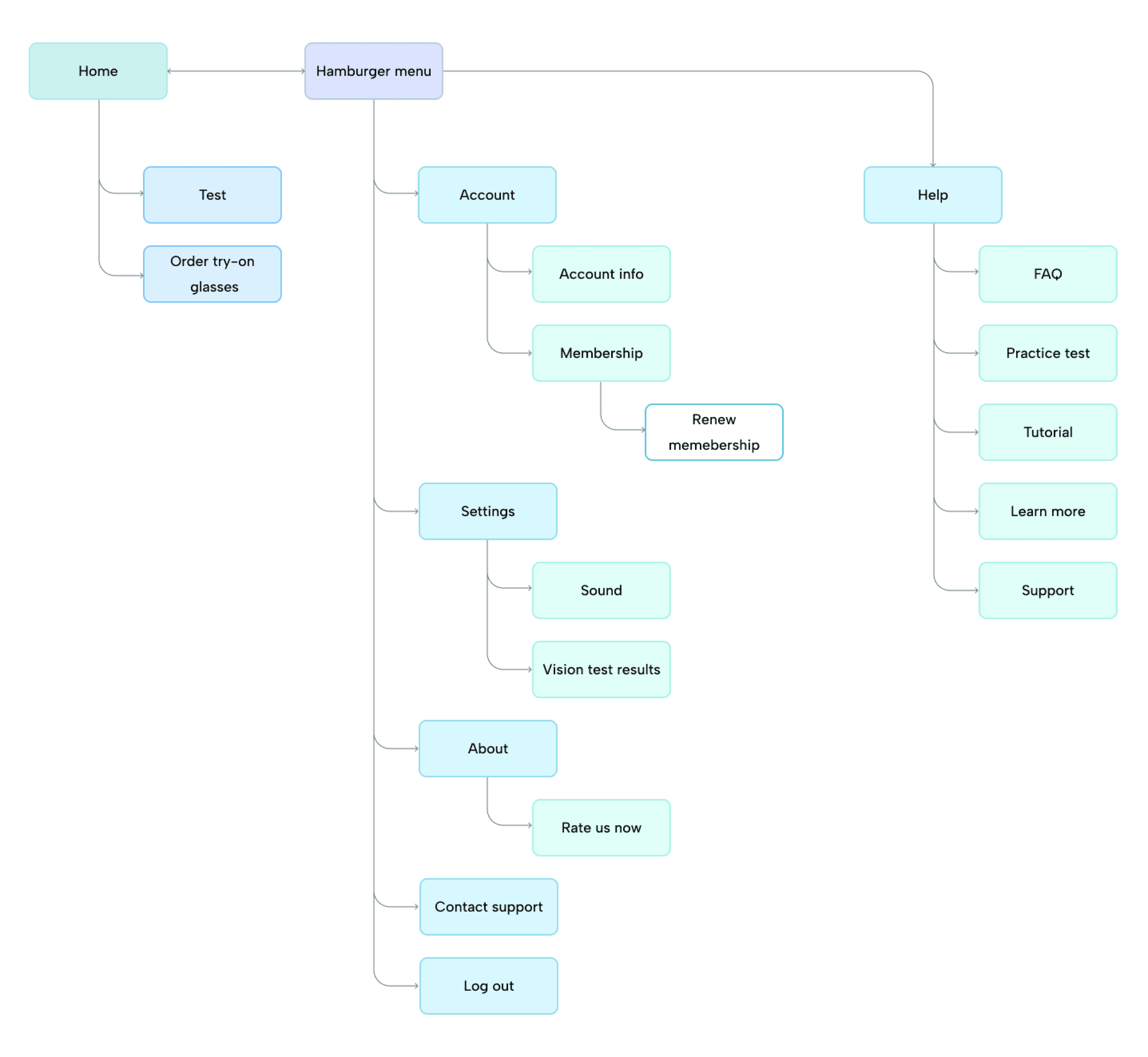
The first step was mapping out the user flow to see what pages were there and see which ones were absolutely necessary to keep and which could be consolidated.
We also discussed new requirements with stakeholders and compiled them into a document to determine what features and thus what pages would be available within the app.
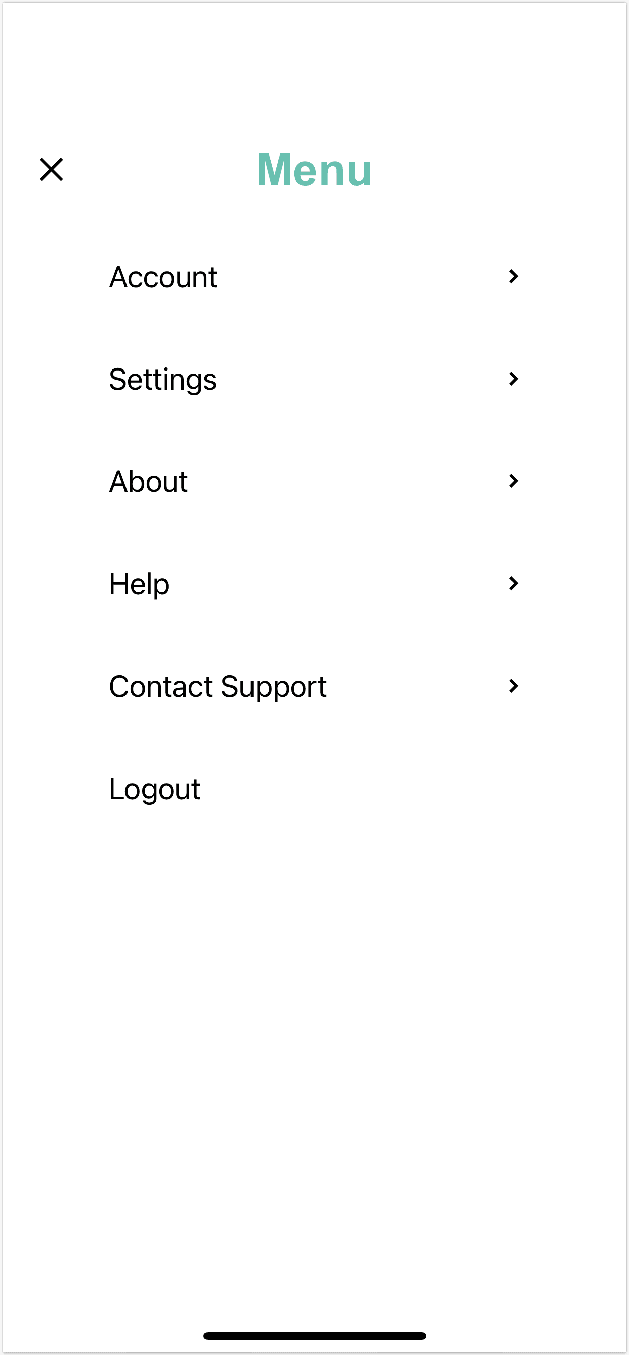
The old navigation was essentially a home page with a hamburger menu containing nearly everything aside from the vision test itself. the information architecture went too deep, and important items like the practice test and support took at least 3 clicks to access.
Define
Main Goals
Update the old hamburger menu navigation into a shallow bottom navigation to make finding pages easier for users
Reduce users’ cognitive load and frustration when navigating through the app
Make the experience of using the app more delightful by including aesthetically pleasing icons in the navigation
Create a new visual style for the VisionCheck app that’s more delightful to users to build user trust and
Develop
Card Sort
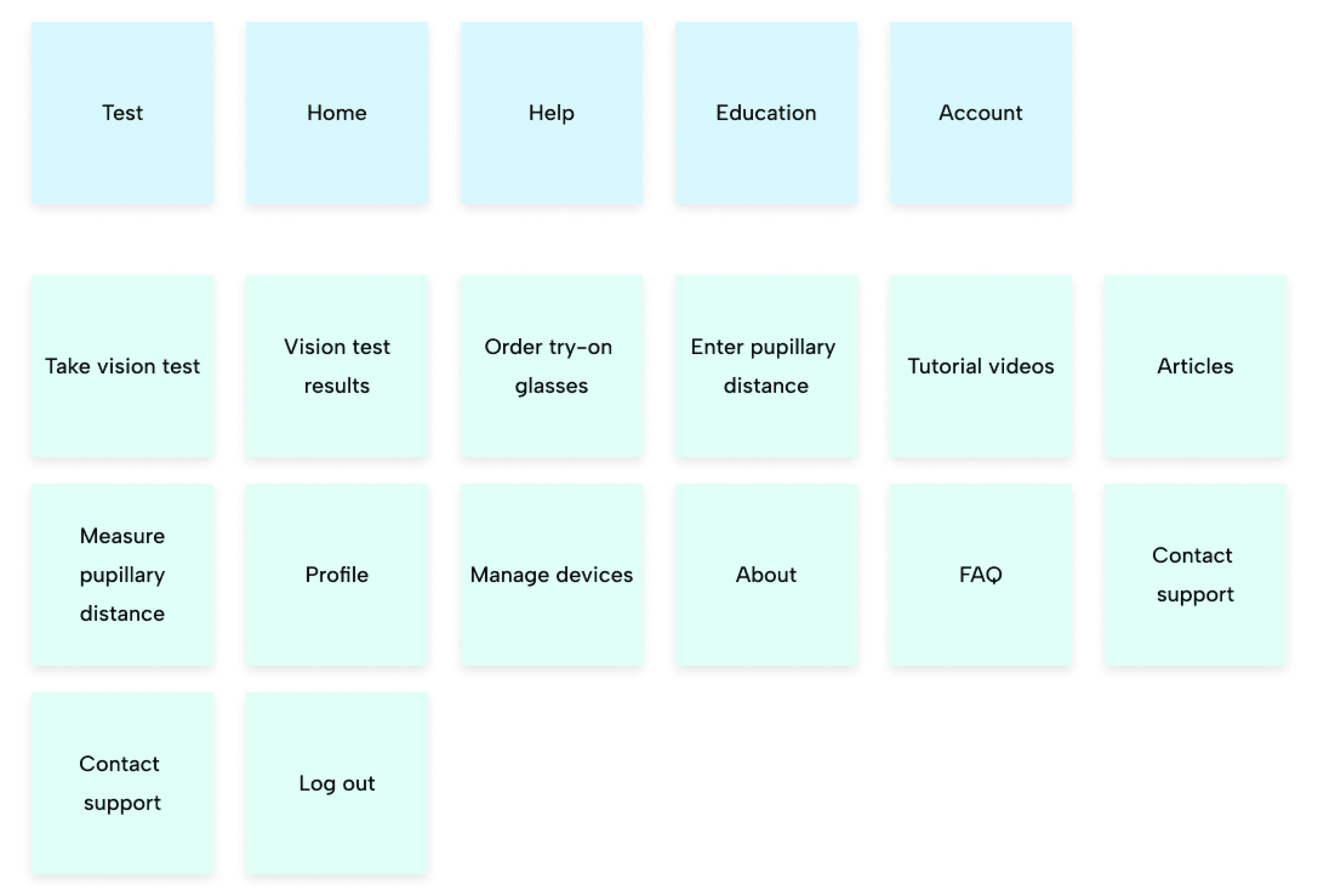
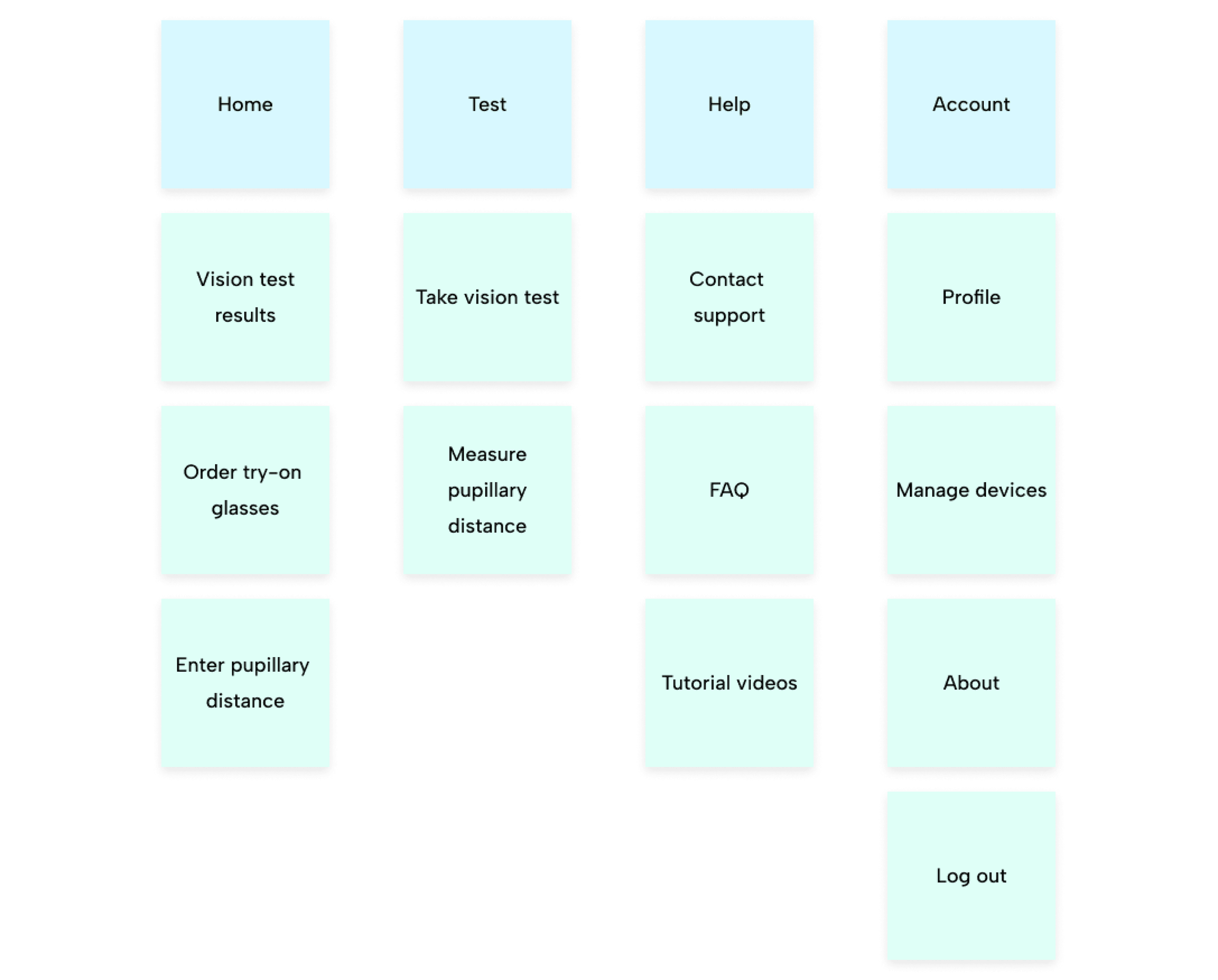
After laying out the exact features and pages that were going to be required in the app, we conducted an internal closed card sorting task with 5 participants to determine how they sorted the following:
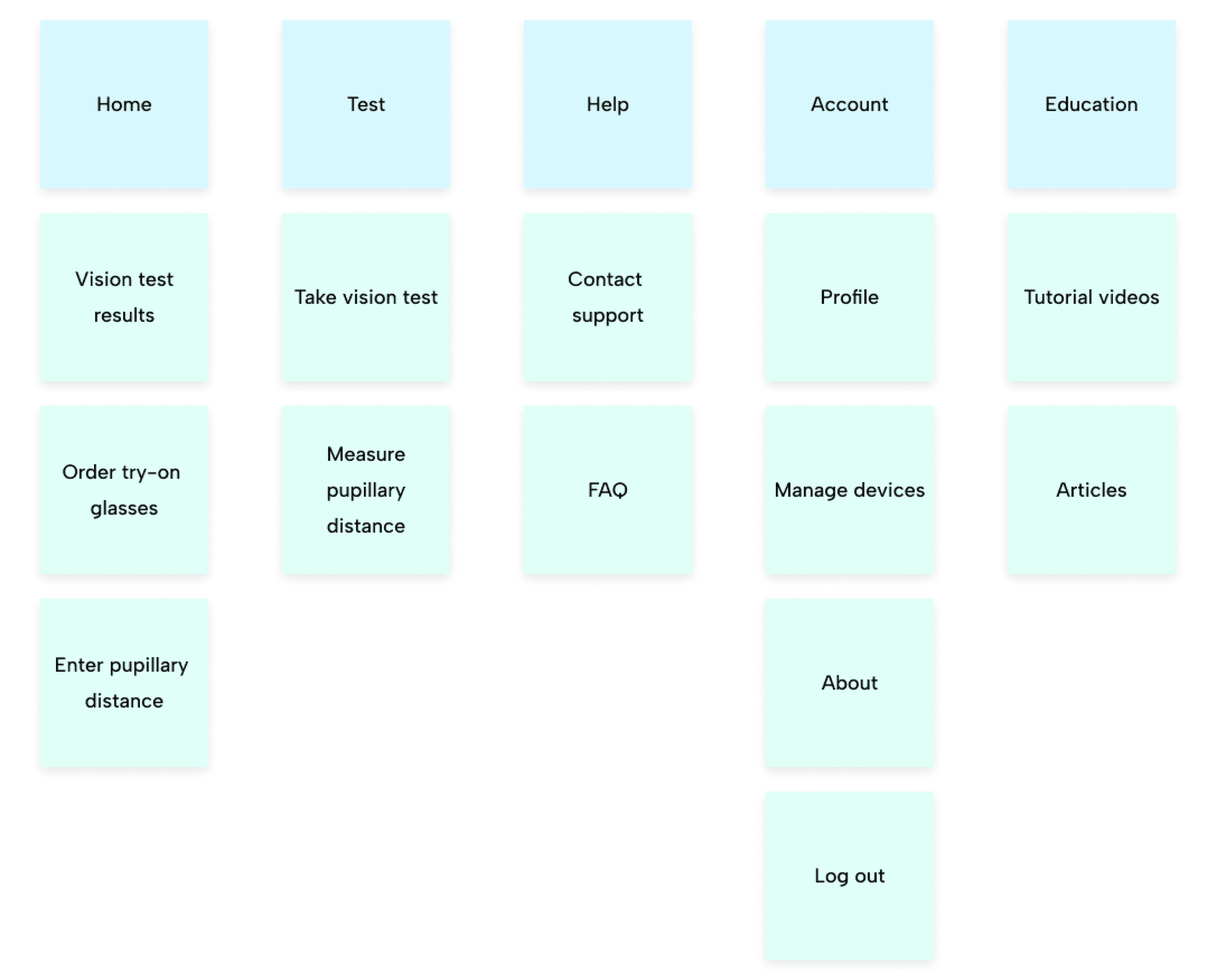
The most common ways that participants sorted and categorized the items was as follows:
Tree Tests
Then we conducted a remote unmoderated tree test via Userlytics to see if people could find where a target page was. The categories were based on the card sort results pictured above. During the test, users were given 9 items, for example “tutorial videos” or “contact support” and instructed to click through until they found it, all while thinking aloud to explain their rationale.
User demographics (10 users per study):
• Ages 18-56 (mean age: 38)
• Interested in new technology, online shopping, and affordable vision care solutions
• Wear glasses or contacts
Data analysis showed that participants consistently mixed up the “education” and “help” sections, often clicking on “education” for items that were found in help and vice versa. Aside from this major issue, participants were able to easily find everything, with 10/10 participants successfully finding every item in the three other sections, validating that the shallow navigation reduces cognitive load and makes finding things easier.
We consolidated the “help” and “education” menu items and removed the “articles” item based on new requirements, then conducted another tree test to validate this change, using the parameters for participant recruitment and the same remote talk aloud protocol as the first tree test.
All 10 participants were able to find every item quite easily, the only issues being with the pupillary distance-related items, as many people just didn’t know what that means. Given that we designed the app to direct the user to the pupillary distance test after they receive their vision testing results and given the amount of educational content we were planning on including in the app to help demystify vision, we weren’t too concerned about this and went ahead with this IA.
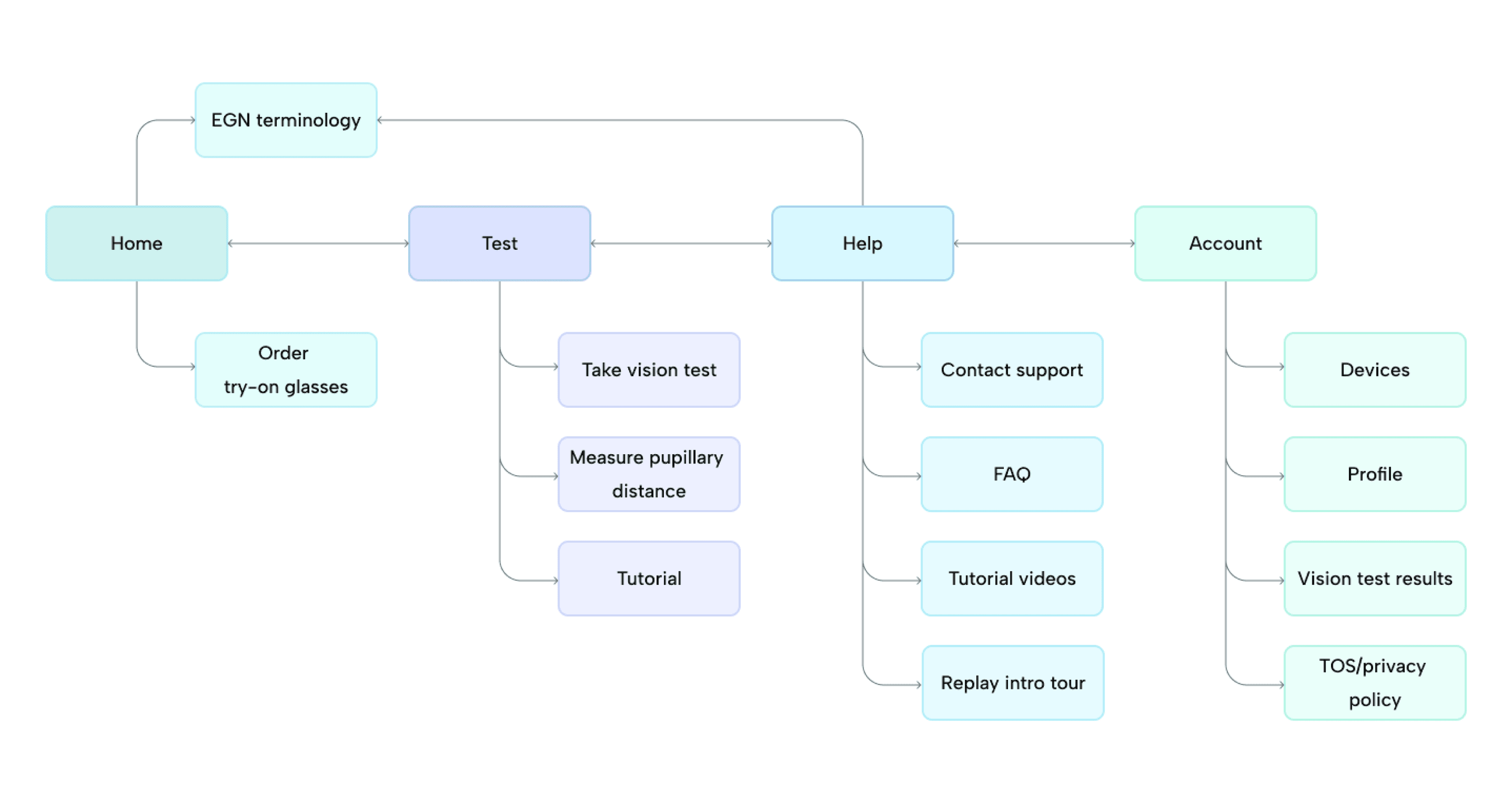
New Flow
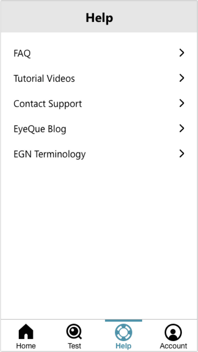
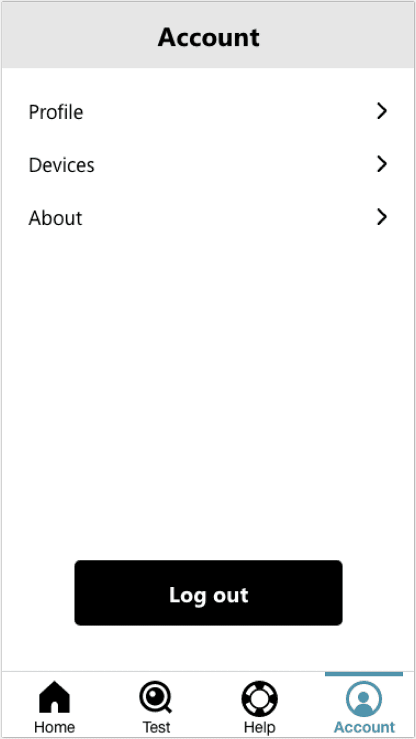
Based on the results of the tree test, we created a new flow to lay out the information architecture, which included making updates to the second level of each navigation bar item in the wireframes to better match people’s mental models of the navigation system based on our observations in the tree test.
We also placed entries to EyeGlass Number terminology both on the home dashboard and in the help tab because participants kept going to the home tab to view it, though it was originally intended to only be on the home dashboard.
Wireframes
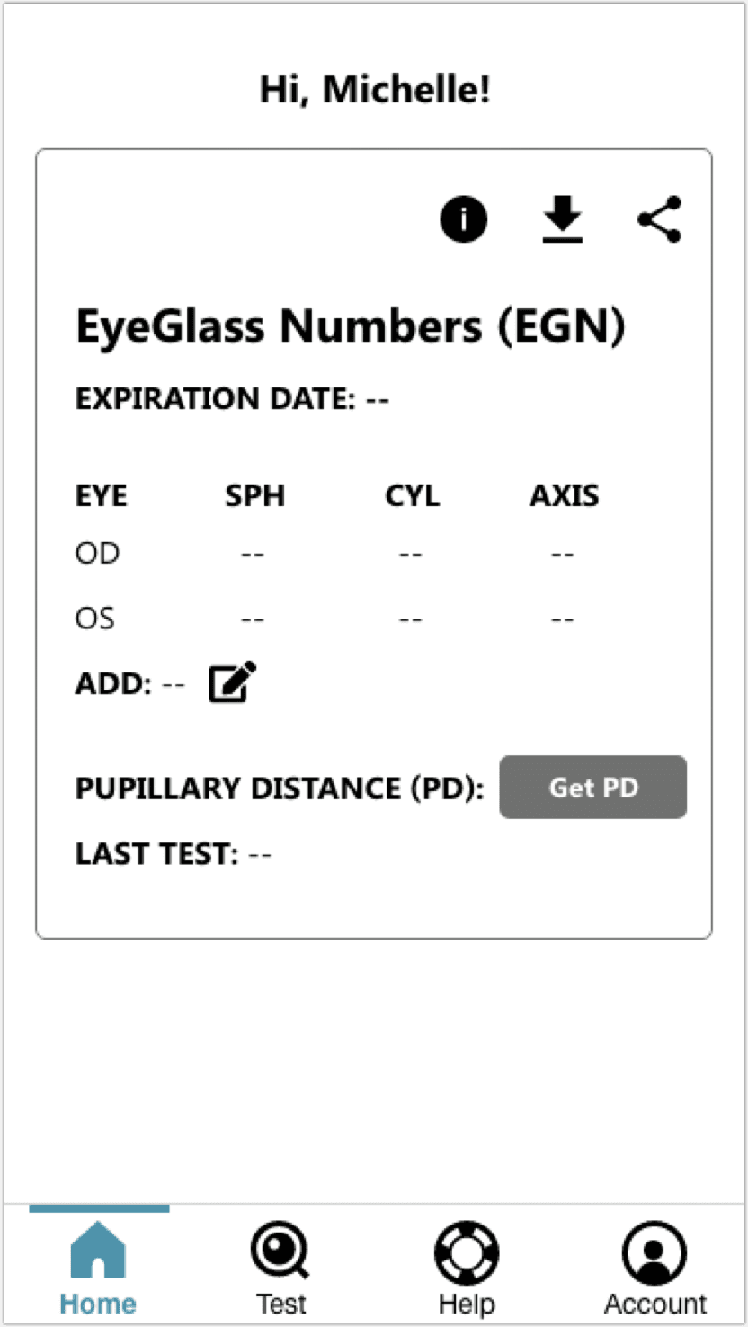
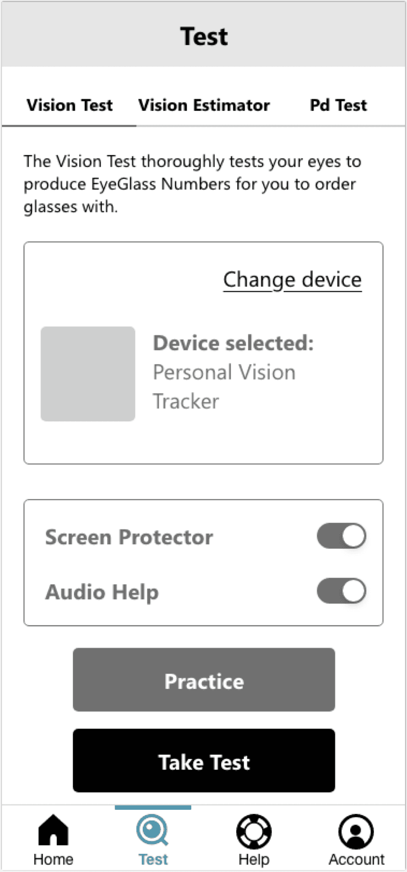
Then we proceeded with the design and created wireframes.
Usability Testing
We tested the wireframes via Userlytics to see if the users were still able to find everything as easily as they did in the previous tree test.
In our remote usability testing protocol, participants were given given 9 items, for example “tutorial videos” or “contact support,” and instructed to click through until they found the item given, all while thinking aloud to explain their rationale, similar to the tree tests above but with wireframes this time.
Participant demographics (5 users per study):
• Ages 18-62
• Interested in new technology, online shopping, and affordable vision care solutions
• Wear glasses or contacts
We found that participants were able to find most of the items, but had trouble understanding what the life raft and magnifying glass icons signified.
Deliver
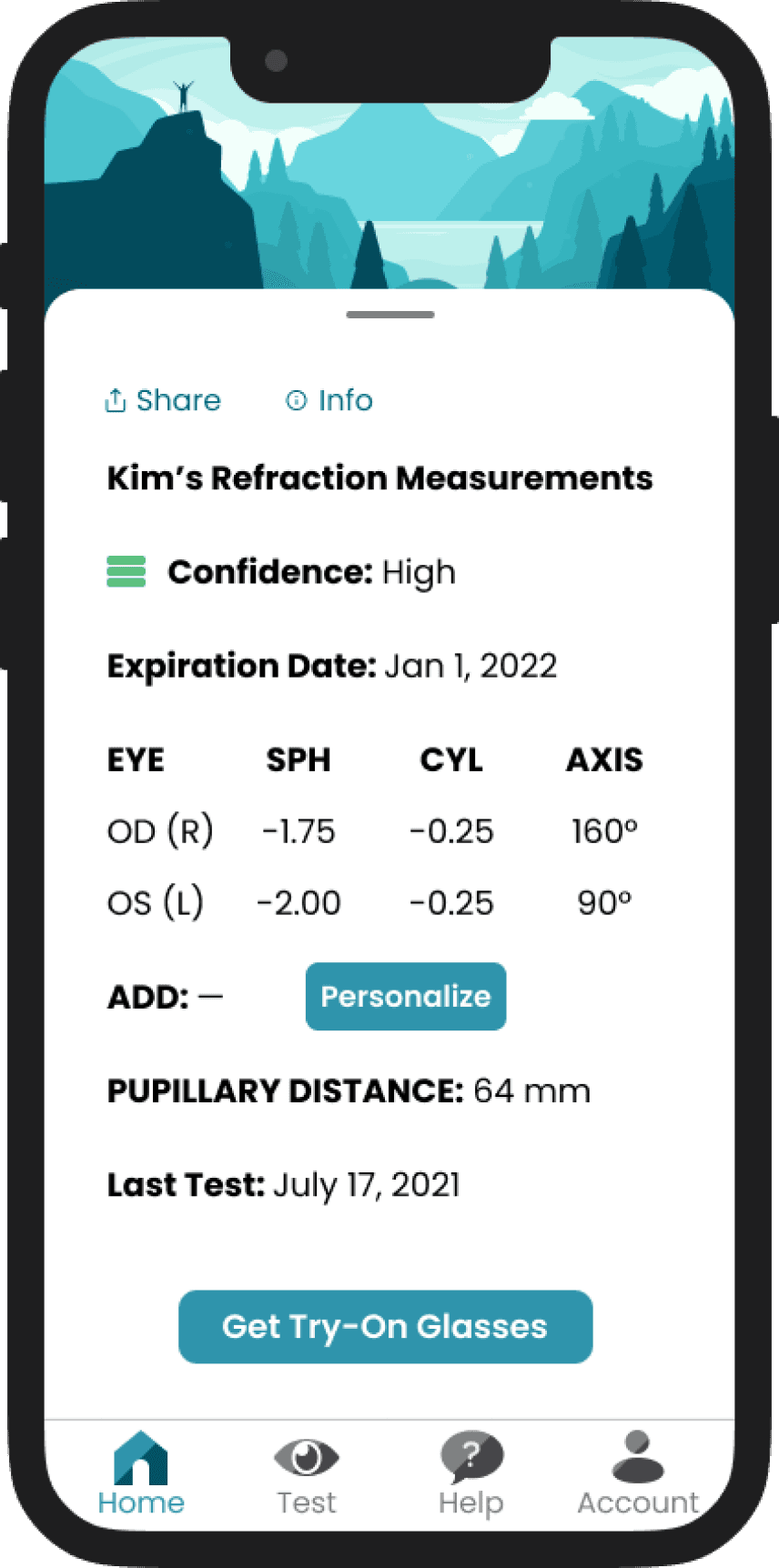
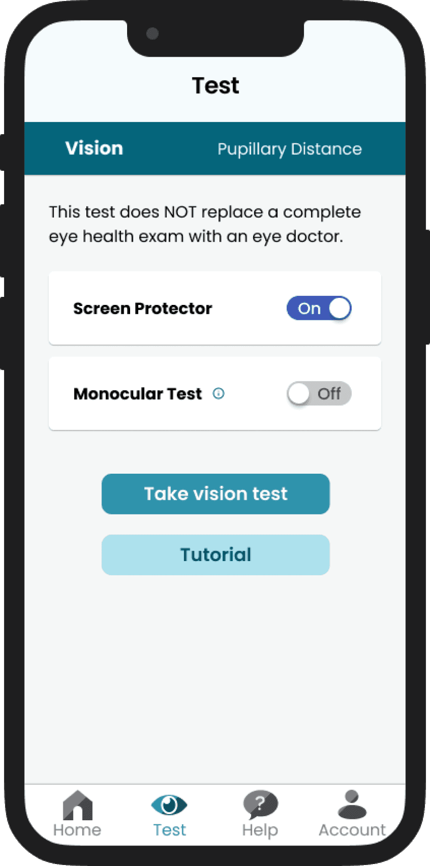
Final Visuals
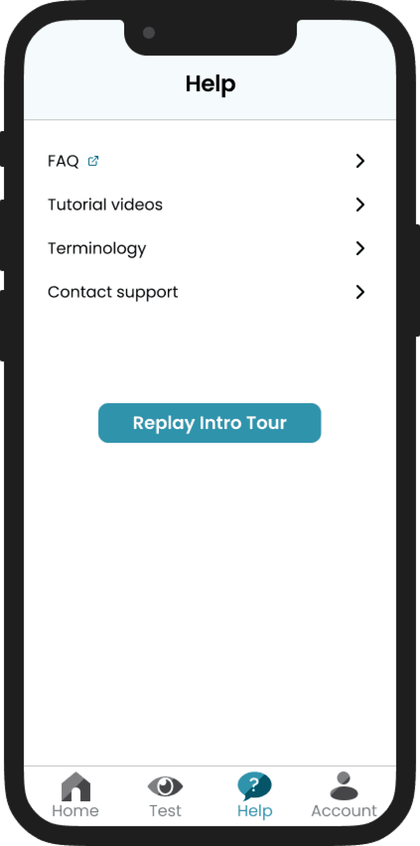
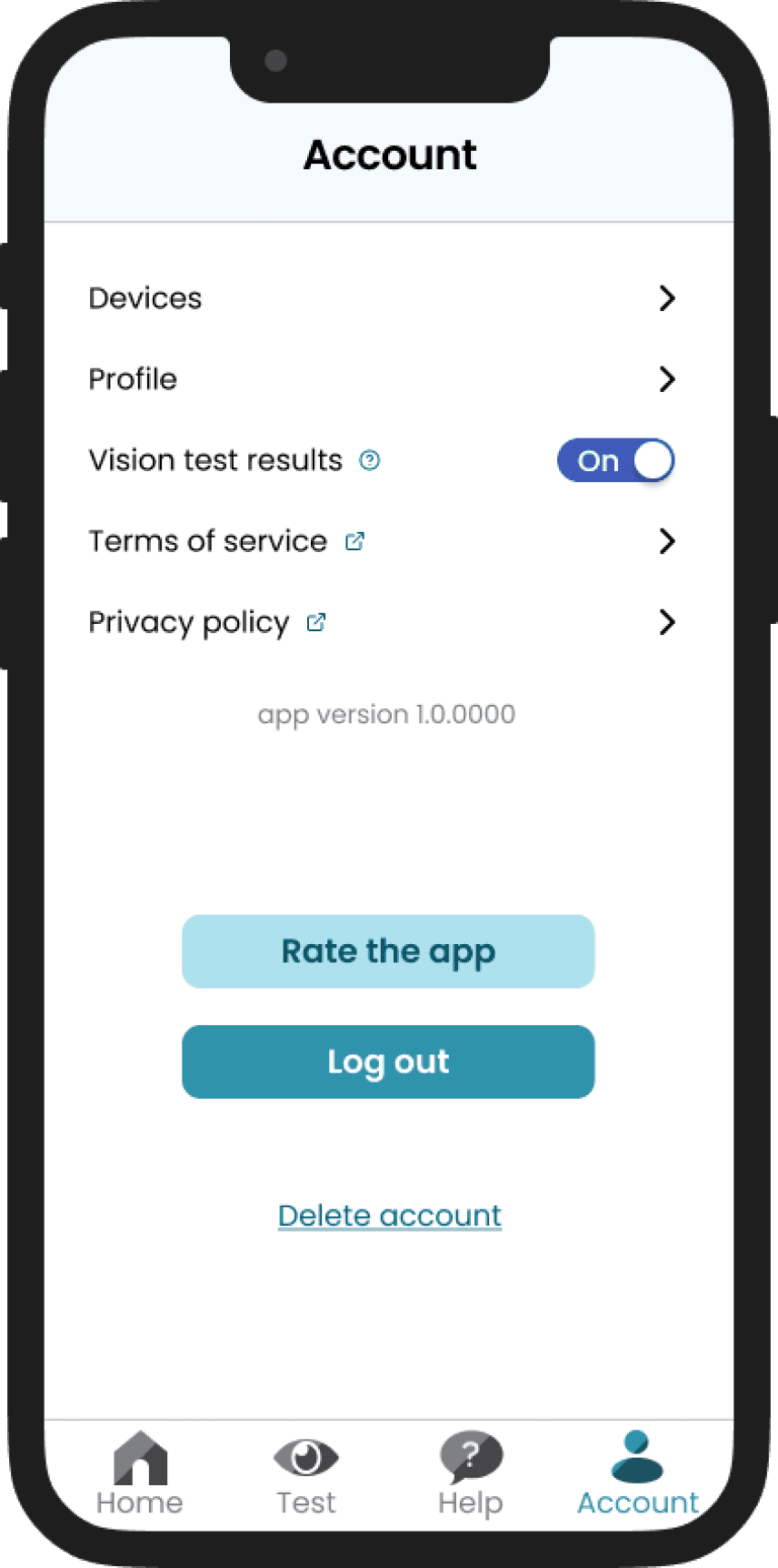
Based on the usability testing, we decided to update the “help” icon from a life raft when creating the final visuals. This was because users weren’t sure how to interpret the life raft, so in the final design we changed it to a question mark - something much more literal. We also changed the “test” icon from the EyeQue logo’s “Q” to an eye to better represent that this is where the eye test is located.
Since we were in the process of creating a brand new design system for EyeQue’s vision refraction apps, we wanted to create brand new icons for the bottom navigation, aside from the test icon which was based on EyeQue’s existing logo.
My co-designer and I collaborated to come up with a style intended to be playful and delightful yet professional and trustworthy while utilizing EyeQue’s signature color - teal. We utilized a lot of straight lines to emulate professionalism and created shading in the icons at a diagonal to look more playful.
Impact
• Created a brand new system for EyeQue to use in future designs, making it quicker and easier to create new designs after the conclusion of this project
• Improvements to overall design documentation
• Improvements to hand-off process to software developers
• 30% increase in EyeGlass Numbers received by users
• Decreased drop-off rate in users taking vision tests (3 tests are required, previously users would drop off sooner before completing all 3 tests)
Reflections
Having great communication between UX and the software development team is so important and helpful. Working with a team that trusts your designs and that you trust to implement those designs correctly is truly fantastic, as is keeping an open line of communication between everyone.
Start-ups are great places to learn, explore, and try new and different things. I’m so grateful to have had a chance to work on the entire end-to-end experience of VisionCheck, from the UX and visuals all the way down to the product packaging. Challenging yourself is a great way to learn!
Other Projects
Back to home
